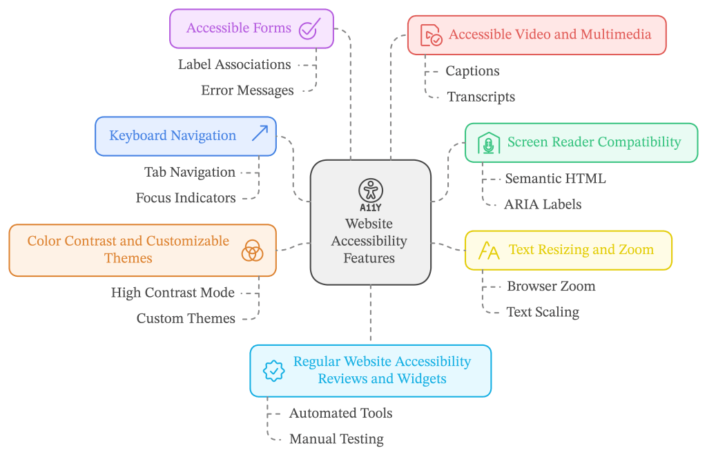
We all love a website that just works, right? It loads quickly, it’s easy to navigate, and, most importantly, it’s user-friendly. But, here’s the thing—how do we make sure that our websites are truly accessible for everyone? That means thinking about more than just good design. It means making sure people with disabilities can use the site just as easily as anyone else. So, whether you’re building a new website or sprucing up an existing one, here are the top accessibility features you absolutely need to include.

1. Keyboard Navigation
Ever tried navigating a website without a mouse? For some, that’s the daily reality. Keyboard navigation is essential for people who rely on their keyboards due to mobility impairments. Your website should allow users to tab through links, buttons, and form fields easily. What’s more, there should be visual cues—like a highlight or outline—around the element that’s currently selected. Otherwise, how would someone know where they are on the page?
Think about this: If your website isn’t keyboard-friendly, you’re shutting out a whole group of potential users before they even get started.
A good rule of thumb is to test your site by navigating solely with your keyboard, especially the tab key. You might be surprised at how challenging it can be!
2. Screen Reader Compatibility
Don’t make your user guess. Imagine how frustrating it would be to hear, “Button…button…link,” without knowing what any of them actually do. Screen reader users deserve better! Make sure everything on your site is labeled clearly and flows in a logical order.
3. Text Resizing and Zoom
Not everyone has 20/20 vision, and even if they do, sometimes your website’s text just feels too small. Giving users the option to resize text or zoom in on your site without breaking the layout is a game-changer. You’ve probably seen sites where zooming makes everything go haywire, with text overlapping or images disappearing. It’s messy, and it’s easily avoidable.
Responsive design is the key here. Make sure your content adjusts smoothly as people zoom in or out. A good site should maintain its structure at different sizes without making anyone squint or scroll horizontally for miles.
4. Color Contrast and Customizable Themes
Color choices are more important than you might think. Sure, colors set the mood and enhance the brand, but they also affect readability. High contrast between text and background colors makes your content easier to read for…

